
We’re so excited to announce some improvements to our portal for participants, nominees and support coordinators.
No one knows what tools and services are needed better than those with lived experience navigating the NDIS.
At MyIntegra we value feedback from our clients. It is how we have continued to grow and improve over the past five years.
With your feedback, we have developed portal dashboards that will make life easier for participants, nominees and support coordinators.
For Support Coordinators
Our goal for Support Coordinators
Many Support Coordinator’s have multiple participants using MyIntegra Plan Management. They shared feedback with us that they wanted a simple and visual way to track the status of their participants’ plans.
Our tech development team used this feedback to develop an interactive and user-friendly way for Support Coordinators to access information about their participants.
With just a glance at our new intuitive dashboards on the portal homepage, Support Coordinators can now identify how their participants are tracking with the spending and utilisation of their NDIS plan.
How it works
The scatter plot represents a Support Coordinator’s participants as bubbles. Each participant has a bubble – and the size of the bubble represents their budget. Hover on a bubble to see exact figures.
- X-axis – how far along a participant is in their plan
- Y-axis – size of a participant’s budget
- The bubbles are colour-coordinated to represent spending habits
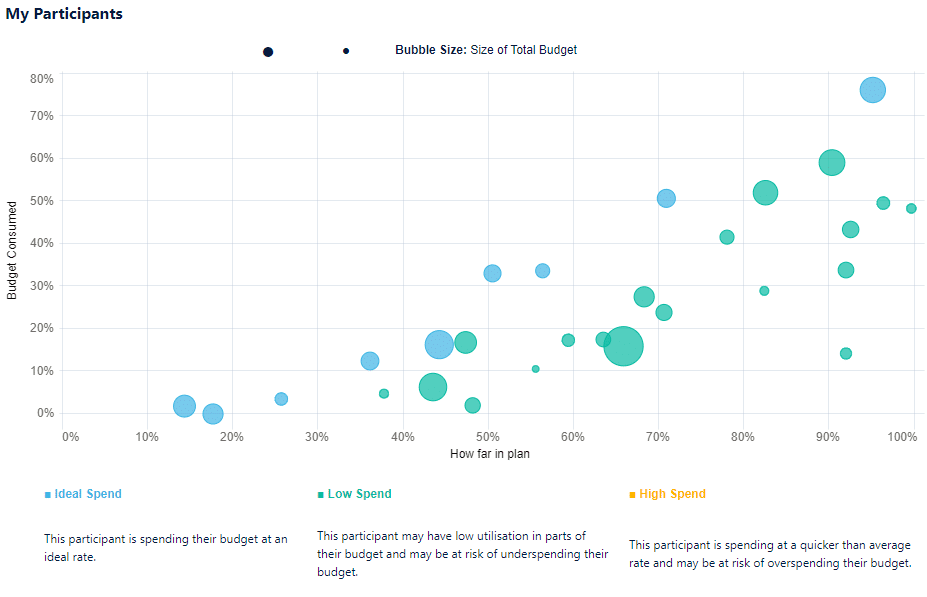
The scatter plot feature of our new dashboards.
- The bar graphs represent support categories, which can be organised by percentage or dollar.
- Similarly, the donut chart shows how much budget has been spent, reserved or unspent and unreserved.
- The charts can be filtered by participant or support category.
- The charts are colour-coordinated to represents types of funds in a participant’s plan.
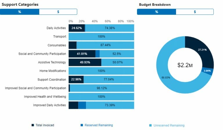
The bar graph and donut chart feature of our new dashboards.
Do you need support accessing your portal or have questions or queries about your new dashboard
For Participants and Nominees
Our goal for Participants and Nominees
We received feedback from Participants and Nominees that it can be confusing to track their spending, especially when reserving funds and being invoiced by providers at various times.
Our simple and user-friendly dashboards will help Participants and their Nominees understand their NDIS plan better.
Participants and Nominees can now see the use and spending of a plan at just a glance.
How it works
On the left-hand side of the dashboard, Participants and Nominees will see Bar Graphs.
Each bar represents a support category. The graph is colour-coordinated to represent how funds have been used (invoiced, reserved and remaining). The toggle at the top of the graph can filter the stats by percentage or dollar amount.
To explore budget use in a specific support category, Participants and Nominees can simply hover their mouse over the graph.
Further to the right of the portal dashboard, Participants and Nominees will see a Donut Chart which represents the total plan budget.
Similarly to the bar graphs, the donut chart is colour-coordinated to represent how funds have been used (invoiced, reserved and remaining). This chart can also be viewed by percentage or dollar amount.
Participants and Nominees can view their past budgets and spending patterns by using the plan date filter in the top right.
Do you need support accessing your portal or have questions or queries about your new dashboard?
